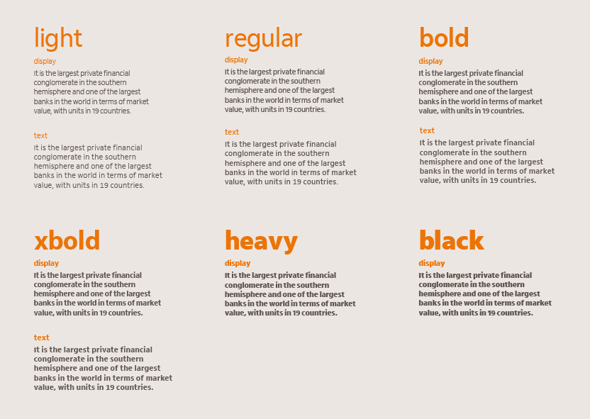
Itaú Typeface
The Itaú typeface is a humanist sans serif, it invites the eyes to go across its open and dynamic forms, creating closeness to the user. The shapes were drawn to bring lightness and performance to digital apps and excellent legibility for smaller text sizes. The Itaú typeface was designed exclusively for the biggest Brazilian bank: Itaú Unibanco. What defines Itaú typeface is the great legibility and excellent performance for digital apps. The main brand’s attributes such as proximity, lightness, and simplicity were reflected in the design of the typeface. The font family consists of two versions: Itaú Display and Itaú Text. Itaú Display has 6 different weights for print design, presentations, and media that includes medium to large text sizes. Itaú Text has 4 weights and is especially recommended for digital applications. The fonts are optimized to increase legibility when used at smaller text sizes due to greater space between the letters, greater x-height, and different letter shapes.


